


From Local Terminal To International Brand
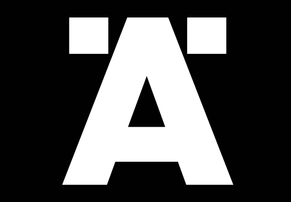
We developed an iconic visual identity built around the Swedish letter Ä. The letter is a strong visual mark that communicates Älvsborg's Swedish heritage and also boldly stands out in the raw harbour environment.
The new visual symbol helps Älvsborg differentiateitself from the other terminals in the harbour. The simplicity of the symbol helps the truck drivers to easily navigate around the harbour and is also used as a typographical element when numbering equipment or writing typographical messages.
The strong and bold implementation helps defining Älvsborg Roro as a strong lighthouse in international waters.
Recognition:
Bronze : Creative Circle
Agency: Halbye Kaag JWT